ParkO
ParkO is a mobile app that helps drivers discover, reserve, and navigate to parking spaces with confidence, designed to remove the frustration of finding parking in busy urban environments.

Role
Product Designer
Timeline
8 weeks
Team
Solo Designer
Platform
Mobile, iOS
Overview
Drivers often spend valuable time searching for parking without knowing which spaces are available, how much they cost, how far they are, or whether they'll still be free by the time they arrive, creating unnecessary stress, traffic congestion, and delays. Users needed a faster way to discover, compare, and reserve parking before reaching their destination.
The challenge
Urban commuters faced several recurring problems:
Limited visibility into available parking spaces
Time wasted driving around crowded areas
Lack of pricing transparency
Complex, fragmented booking experiences
The goal was to design a solution that reduced search time, simplified decision-making, and gave users confidence throughout the booking journey.
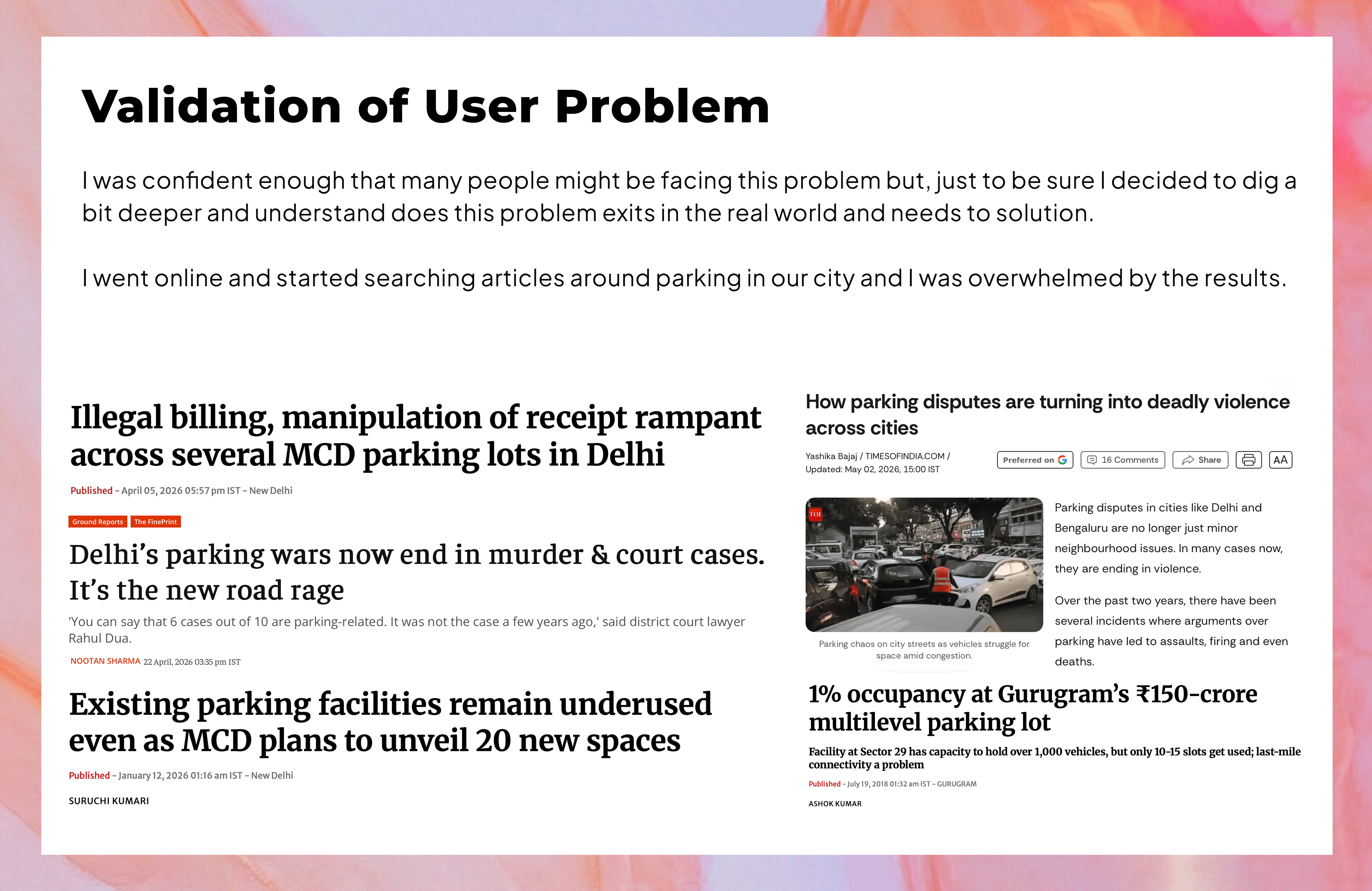
Research and insight
What we learned:
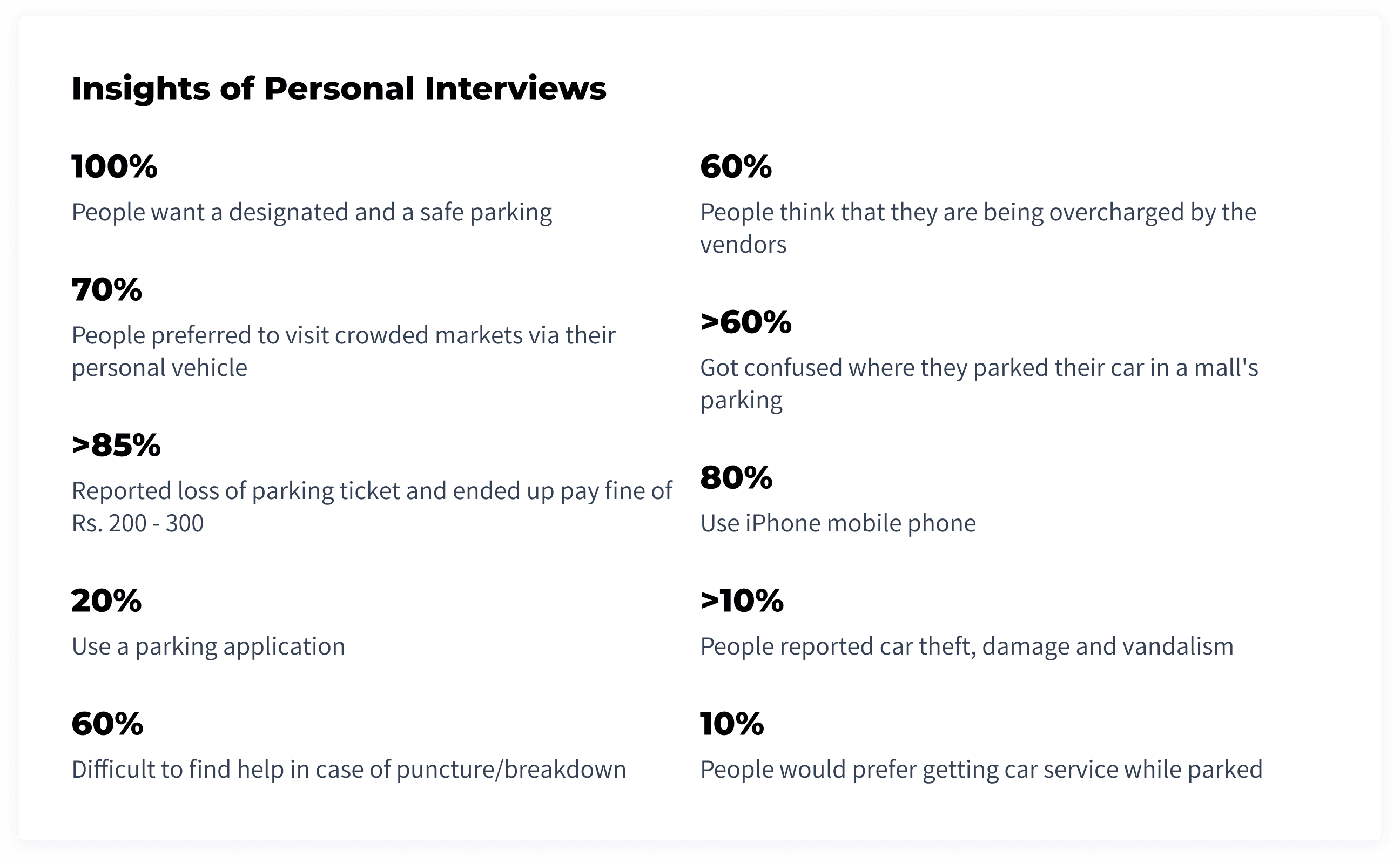
Finding parking is harder than driving there — 88% struggled to find a spot in crowded locations
People don't trust the current parking experience — 60% felt they were being overcharged
Parking management is still largely manual — 52% lost tickets, 67% forgot where they parked
Users want certainty before they arrive — 66% preferred reserving a spot in advance
The market remains underserved — 97% had never used a dedicated parking solution
"I don't mind paying for parking. I just don't want to waste 15–20 minutes trying to find it." — Urban Commuter, Research Participant
Users weren't looking for another parking app — they were looking for confidence, convenience, and certainty throughout the parking journey.
Product strategy
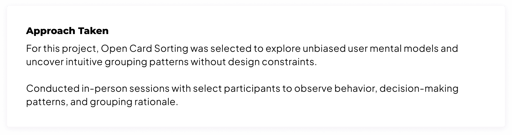
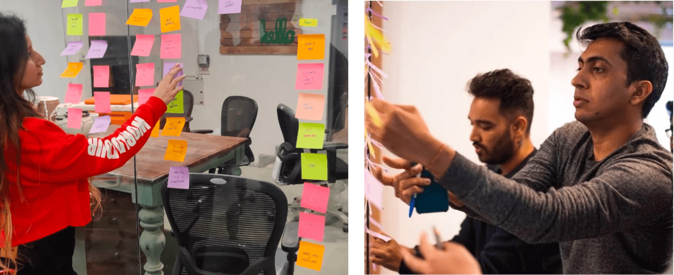
Through interviews and workflow analysis, I explored several interface directions before landing on the final approach, focused on reducing visual clutter while keeping the information that mattered most accessible at every step of the journey.
During usability testing, users understood the booking flow quickly but sometimes struggled to compare parking options. Information hierarchy was refined and parking details reorganized to surface the most important details first, helping users decide faster with less cognitive effort.
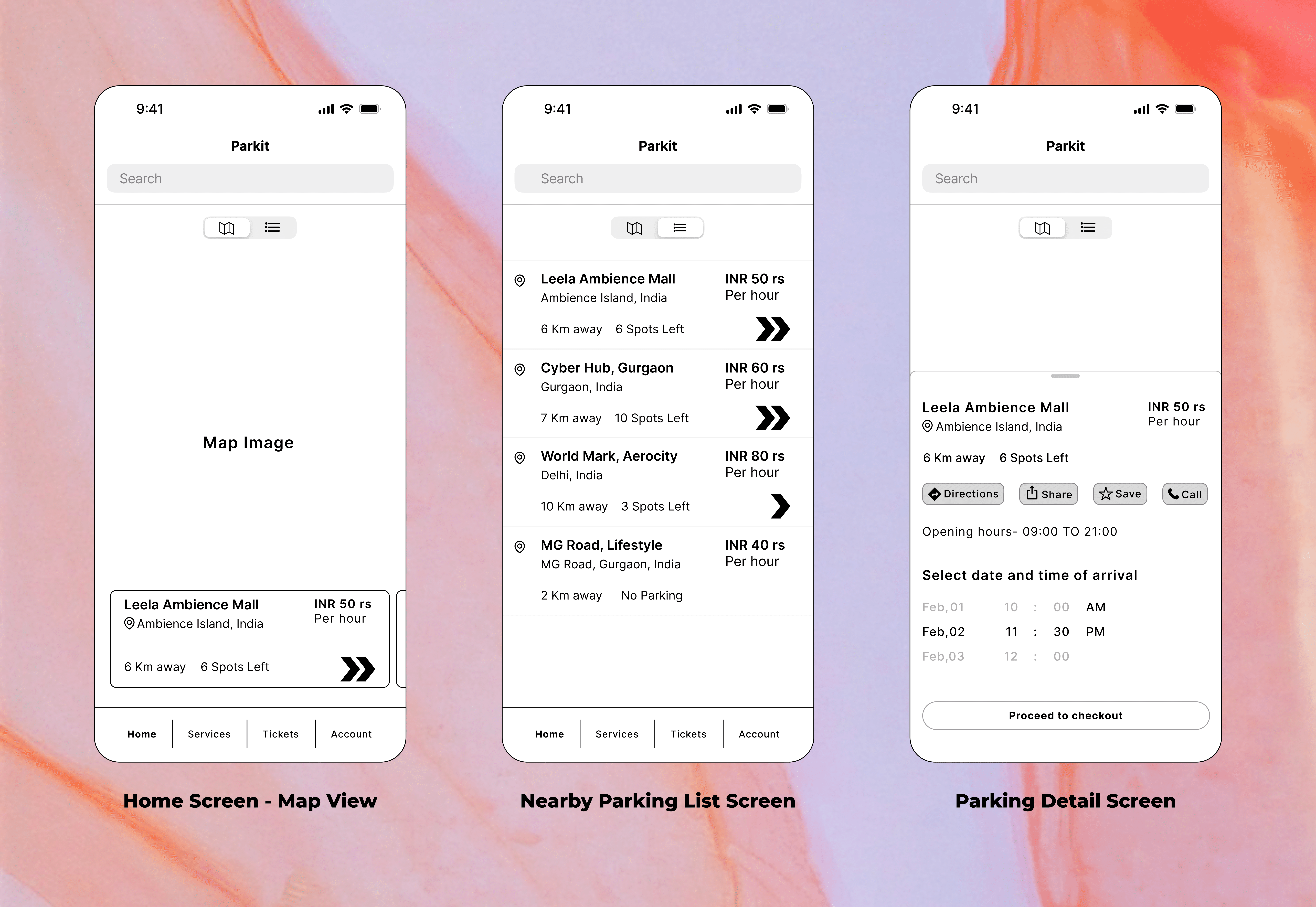
Experience architecture
Experience Architecture
Early concepts tested different approaches to parking discovery, comparison, and booking — shaping a flow where users could move from search to reservation with minimal friction and maximum clarity at each decision point.
Interface System
The final ParkO experience lets users:
Discover nearby parking spaces
Compare options quickly
Reserve spots in advance
Navigate directly to their destination
Clear information architecture, intuitive interactions, and a streamlined booking flow turned parking from a stressful task into a predictable, confidence-driven experience.
Outcome
Three major insights carried forward:
Users prioritize certainty over choice — fewer, reliable options beat browsing dozens of spaces
Pricing transparency builds trust — users wanted pricing up front, before any commitment
Navigation is part of the experience — booking a spot isn't the end goal; successfully reaching it is
These learnings became the foundation for every design decision moving forward.